Slides That Stick: Top Online Tools for Presentations That Captivate
Whether you’re pitching to investors, teaching a class, or leading a webinar, one truth remains: a great presentation isn’t just about what you say — it’s how you show it. In the digital age, visuals speak louder than bullet points, and your tech stack can make or break your audience’s attention.
The right tools can turn dry data into stories, bring interaction to the forefront, and simplify your message in visually impactful ways. Here are some of the best online platforms to help you create and deliver a presentation that people actually remember — and act on.
1. Pitch: Design and Deliver, All in One
Pitch is a modern presentation software that’s perfect for teams and solo creators alike. Its real-time collaboration features make it ideal for remote environments, while its sleek design templates give even non-designers a polished look.
Unique Tip: Use Pitch’s analytics feature to see who viewed your deck and which slides held their attention longest. This is great for follow-up customization after a sales meeting or virtual pitch.
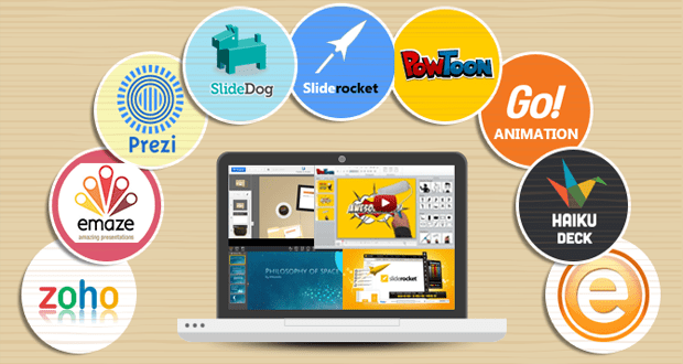
2. Prezi: Say Goodbye to Static Slides
Prezi uses motion-based storytelling to guide viewers through your content. Instead of linear slides, you zoom in and out of topics, making it feel more like a guided journey than a lecture.
Unique Tip: Prezi Video allows you to appear inside your presentation when delivering it virtually. This “green screen-style” approach keeps both you and your visuals on screen at once — increasing retention and reducing screen fatigue.
3. Beautiful.ai: Let the AI Handle the Formatting
Beautiful.ai lives up to its name by automating slide layouts and spacing, so your presentation looks balanced and clean without fiddling with design tools.
Unique Tip: Use the “Smart Templates” to adapt your content automatically — great for people who tend to overfill slides. It’s also helpful for repurposing a single presentation for multiple audiences by quickly swapping out data sets or branding.
4. Mentimeter: Make It Interactive in Real-Time
Mentimeter is a game-changer for live engagement. It lets you build polls, word clouds, multiple-choice quizzes, and interactive charts that update in real time as your audience participates — even from their phones.
Unique Tip: Use a quick interactive quiz mid-presentation to reset attention and encourage active listening. Bonus: it provides data you can share in post-event follow-ups.
5. Tome: Tell a Visual Story Fast
Tome is a narrative-focused platform that blends slides with multimedia blocks like videos, GIFs, charts, and even live embeds. It’s built for modern storytelling — great for product demos, brand storytelling, or concept pitches.
Unique Tip: Use Tome’s Notion-style interface to storyboard your presentation first, then populate with visuals. This helps clarify your message before you start designing.
6. Lumen5: Turn Blogs or Scripts into Video Presentations
If your presentation would benefit from motion or you’re working in a video-first environment (like social media or remote onboarding), Lumen5 turns written content into short, compelling videos.
Unique Tip: Use Lumen5 to summarize a longer presentation into a teaser or recap video for LinkedIn or email follow-ups. It’s a quick way to extend the life and reach of your message.
FAQ: Infographics & Presentations — Turning Data Into Visual Impact
A strong presentation isn’t just about talking points — it’s about clarity, engagement, and how well your audience retains what you say. Infographics are one of the most effective ways to deliver dense or complex information clearly and memorably. Below are some frequently asked questions by presentation creators looking to master infographic design.
Q1: Why should I include infographics in my presentation?
Infographics help simplify information, especially for audiences that need to absorb key insights quickly. Whether it’s breaking down a process, showing a timeline, or visualizing statistics, infographics make your presentation more digestible and visually appealing — especially for hybrid or virtual audiences
Q2: What’s a good tool for building infographics if I’m not a designer?
Adobe Express offers a user-friendly infographic generator with templates tailored for business, education, and data storytelling. If you’re new to design, this may help you skip the blank canvas stress and focus on the message. The drag-and-drop format and customization options make it easy to align with your presentation theme.
Q3: How do I decide what data to turn into an infographic?
Start with information that’s dense, comparative, or sequential — things like stats, timelines, step-by-step processes, or survey results. These types of content benefit most from visual breakdowns and can otherwise overwhelm an audience if presented as text-heavy slides.
Q4: How can I keep infographics from cluttering my slides?
Use infographics as highlights or inserts, not full-slide replacements. Introduce the concept verbally, then flash the infographic to reinforce it. If needed, include a link or QR code to a full-size version in your follow-up materials.
Q5: Can I repurpose infographics after the presentation?
Absolutely. A well-designed infographic can double as a blog image, LinkedIn post, PDF download, or part of an email campaign. Tools like Piktochart and Visme also allow you to export in multiple formats for reuse.
Presentations aren’t just slides — they’re experiences. The best tools don’t just make your content look better — they make it easier to deliver, more fun to watch, and far more likely to stick.
From smart design to interactive storytelling, today’s platforms offer more control and creativity than ever before. So go beyond bullet points, and build something your audience will remember and act on.